There is a lot of discussion about the current state of home affordability for both first-time and move-up buyers, and much of the narrative is tarnished with a negative slant. However, the truth is that home affordability is better today than at almost any time in our history.
The naysayers are correct in the fact that affordability today is not as good as it has been over the last several years. But, we must remember that home prices collapsed during the housing crash, and distressed properties (foreclosures and short sales) kept home values depressed for years. A different story is revealed when we compare affordability to the decades that proceeded the crash.
Here is a graph of the
National Association of Realtors’ Housing Affordability Index. The higher the graph, the more affordable homes are.
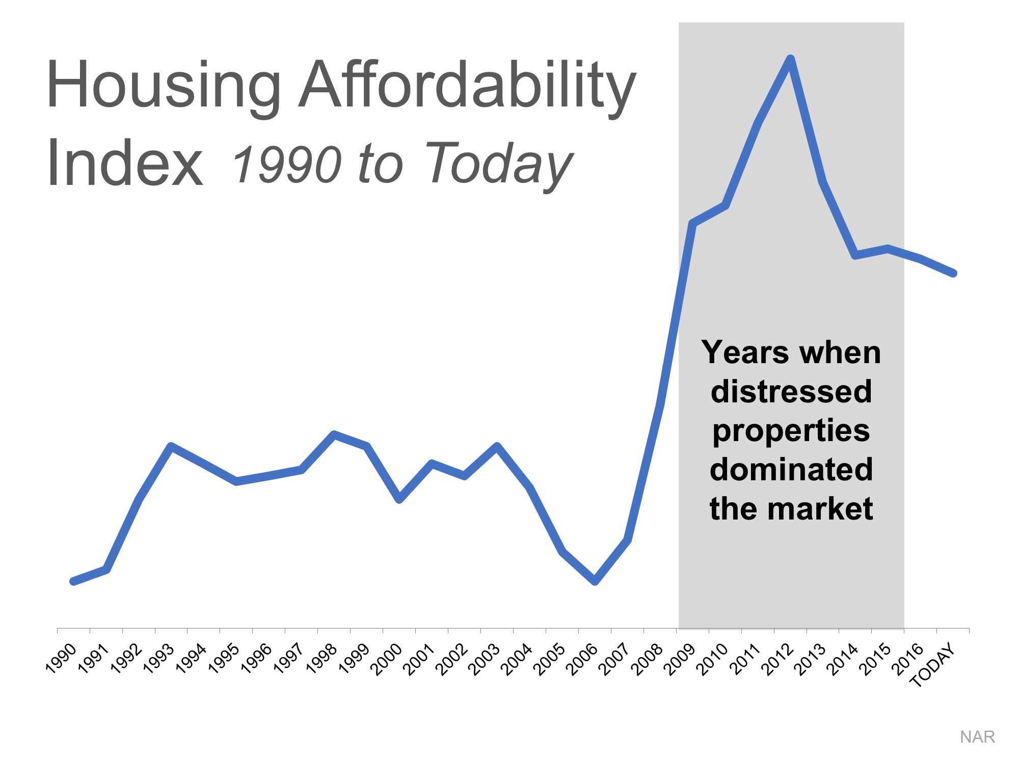
We can see that affordability is better today than in the fifteen years prior to the boom and bust.
CoreLogic just published a report showing the
National Homebuyers’ “Typical Mortgage Payment.” Here is a graph of their findings:
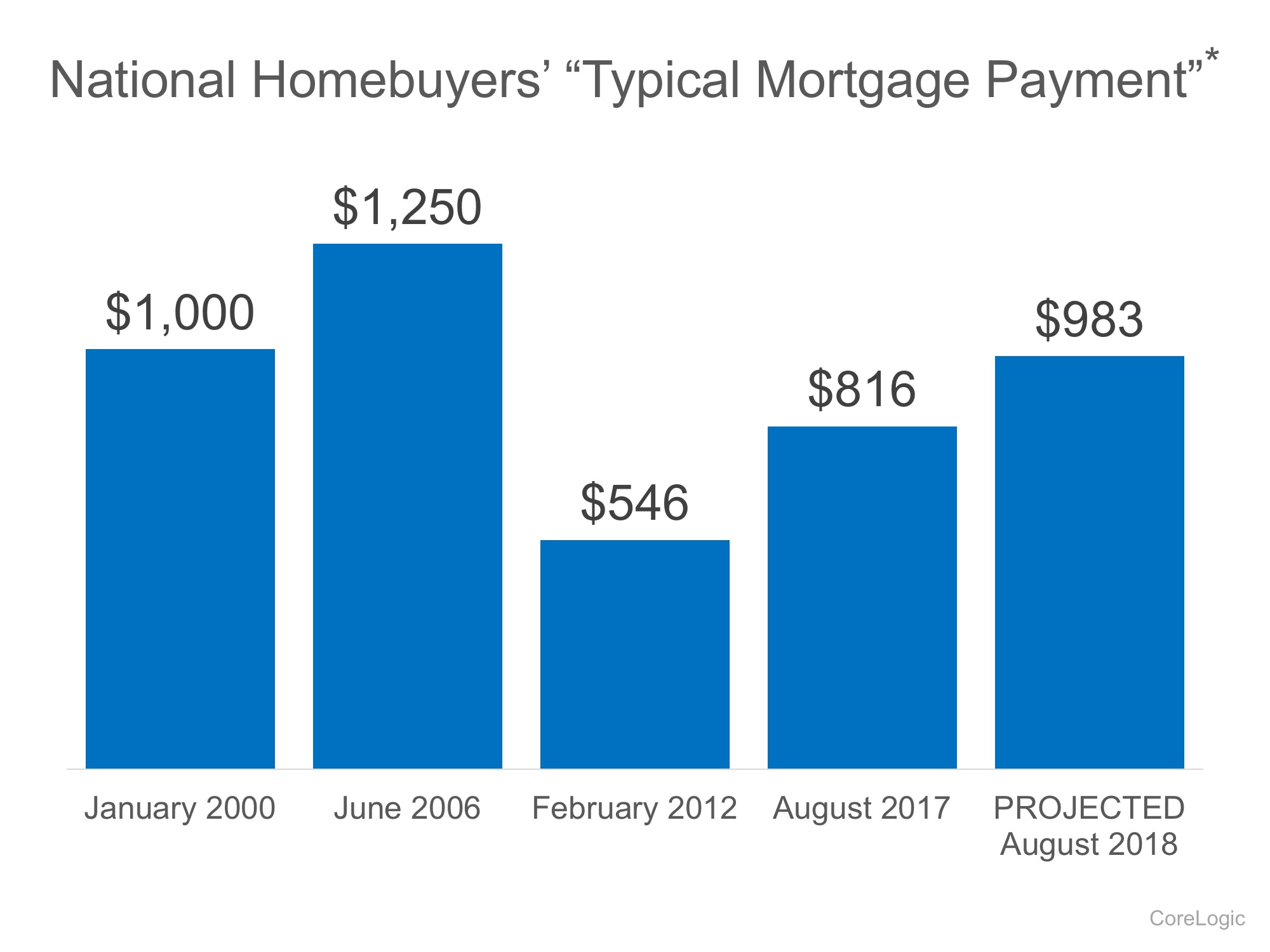
It reveals that though a ‘typical’ housing payment was less expensive in 2012
, it is currently less expensive than it was in 2000. And it is still projected to be lower next year than it was in 2000.
Bottom Line
Mark Fleming,
Chief Economist at
First American, explained it best:
“While borrowing power for the potential home buyer has fallen relative to the low point of 2012, it remains high today and will remain high next year, relative to the long run average. If you don’t want to rent anymore and are considering becoming a homeowner, even if mortgage rates rise next year, your borrowing power will remain strong by historic standards.”